

Today, investing in a seamless website design is a necessity. However, to live up to your users’ expectations and evoke positive emotions, there is yet another approach you need to take into consideration and that’s user experience (UX) design.
Here is how tiny web design elements can take your user satisfaction to a whole new level.
Visual Appearance Impacts Your First Impression
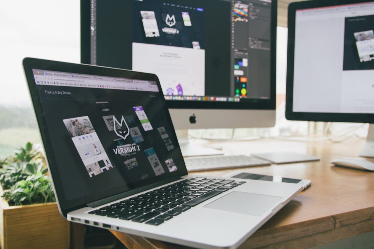
As an Ozzie, I’m constantly keeping track of the major web development trends in Australia. Recently, I’ve stumbled upon the “Design, test and iterate: That thing smart Sydney web designers do” article, emphasizing the rise of user-centered web design in Sydney. These practices are not just about the visual appeal anymore. They’re all about delivering the engaging, holistic approach, based on harmony, trust, spirit, and emotions.
UX design is focused on creating a balance between your website’s elements. Its aim is to give your site a unique personality and elicit emotions in your users, through the use of visual content, colors, typography, and similar elements.
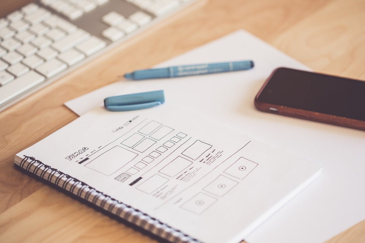
Here are several details that will help you build a site that goes beyond the visual aesthetic.
- Responsive design, meaning that your site looks, feels, and works the same, irrespective of the device used.
- Parallax scrolling includes overlaying of visual elements, giving your site the sense of depth.
- Large, bold fonts let your visitors get the most value out of every statement on your site.
- Visually appealing CTAs. Give users enough space to click or tap, place them in easily reachable zones on the site, and choose contracting, but pleasant colors.
- Multimedia content breaks up text and makes it more interactive. Its aim is to tell a story about your brand. This is why it needs to be consistent, in terms of cropping, filters, orientation, and size. They should also evoke emotions, be relevant to your brand’s goals, and show the human side of your brand.
- Colors are directly linked to brand recognition and customer conversions. Optimize your design for color-blind users and make sure your contrast is not overly aggressive. Prioritize warmer and bright colors, while dark colors should remain in the background.
User-Friendly Navigation Means Clarity and Usability
The fact that someone clicked on your site means that they’re looking for some sort of information. And, they want to find it fast. This is why you need to design your site in a logical, easy-to-follow manner.
This usually means improving your navigation. After landing on a site, 50% of visitors use its navigation menu to orient themselves. Moreover, if they’re not satisfied with the navigation, 67% of mobile users would leave your site.
Given this fact, it’s obvious that just adding a navigation menu to the top of your site is not enough to make your visitors happy. You need to make their browsing experience as smooth as possible.
For example, a traditional dropdown menu works well on those sites that have numerous to present. Still, there are some additional, more exciting navigation trends you should consider:
- A hamburger menu– the navigation is hidden, making it a perfect way to declutter the screen.
- A fixed position menu– your header area remains visible while users scroll down, allowing them to get back to the desired navigation option is the blink of an eye.
- A card grid menu consists of a set of images, divided into expandable blocks. They’re clear, easy-to-use, and visually appealing, which makes them perfect candidates for both mobile and desktop sites.
Design should Highlight Professionalism

There are numerous sites similar to yours out there. So, if you want to win over your customers, you need to position yourself as highly authoritative. This is why your website design should be sleek and emphasize your professionalism. Before they even start reading your content, your visitors should think: “Wow, these guys know what they’re doing.”
- Have a culture page, where you should talk about your brand values, mission, daily challenges and operations.
- Post the photos of your staff to humanize your brand. These photos help your visitors relate to your business and tell them that you’re far more than a simple brand name.
- Present customer results. Be it statistics about customer satisfaction, your major milestones, business reviews, or testimonials, these elements show that you’re trustworthy.
People don’t Love to Wait
Load time is, as its mere name say, a metric telling how long a user needs to wait for a page to load. Apart from its impact on your rankings, page speed is one of the most common reasons why people leave a site without taking the desired action. Your visitors expect your site to load in less than 3 seconds. Otherwise, they will kick it.
So, what can you do to make your site faster?
- Optimize size images. Allow compression that can reduce image size by almost 40%.
- Use lazy loading– your images load as a user scrolls down.
- Remove auto-play multimedia, which has also proven to be one of the most irritating means of content promotion. Your video and audio content should require manual activation.
- Use lots of white space to minimize data demand. It also makes your content organized, making it simpler for users to find and follow it.
Over to You
Focusing on user experience when designing a site has never been more important. A holistic, comprehensive approach to UX design gives you the opportunity to position yourself as a leader in your niche, improve your users’ satisfaction and, above all, build stronger relationships with them.
How do you use web design to boost user experience? We’d like to hear from you.


Leave a Reply